
Go Bilingual
Defining a product before designing it
Transforming an early business vision into a scalable learning platform for teachers and school administrators.
Overview
Role
Lead Product Designer
Timeline
2019-2020
Responsibilities
Product Strategy • Discovery • UX Research Synthesis • Information Architecture • Product Design • Design System • Prototyping • Developer Handoff
Plaftorms
Web & Mobile
The Opportunity
Go Bilingual started as an ambitious business initiative.
The goal was to make high-quality English education accessible to private schools through a digital platform that supported both teachers and school administrators.
When I joined the project, however, there wasn't a product.
There was only an idea.
There were no user journeys, no information architecture, no Design System, no interface patterns and no validated product strategy.
The challenge wasn't designing screens.
It was defining what the product needed to become.
Understanding the problem
Before discussing features, we needed to understand who we were designing for.
Working alongside Product, Engineering and an external research partner, we conducted workshops, Design Sprint activities and user research with educators.
One insight quickly emerged.
Teachers weren't primarily looking for more educational content.
They were looking for confidence.
They wanted easier access to mentorship, professional guidance, curated teaching resources and opportunities for continuous professional development.
As we mapped the ecosystem, another audience became equally important.
School administrators had completely different goals.
Their priorities revolved around managing staff, organizing school operations and supporting teachers—not consuming educational content.
Trying to satisfy both audiences inside the same experience would create unnecessary complexity.
Instead, we reframed the product as two connected platforms with distinct responsibilities.
Teacher Portal, focused on professional development.
Administrative Extranet, focused on school operations.
That decision became the foundation for every product decision that followed.
Designing through constraints
Like many early-stage products, Go Bilingual had to balance ambition with execution.
The product had already been commercialized, making delivery speed a critical business requirement.
One of our earliest strategic discussions centered on technology.
Should we build an entirely new platform or leverage existing infrastructure?
The team decided to build on top of an existing architecture already used internally.
Rather than spending valuable time rebuilding technical foundations, we focused our effort where Design could generate the greatest impact: creating a product that solved real user problems.
Working within existing technical constraints also encouraged simpler, more intentional design decisions throughout the project.


Creating a scalable design language
Since no digital product existed, neither did its visual language.
One of my primary responsibilities was creating Go Bilingual's Design System from the ground up.
Rather than treating it as a collection of UI components, I approached it as a product in itself—a shared language between Design and Engineering capable of supporting future growth.
Inspired by Atomic Design principles, the system established reusable foundations for the entire platform, including typography, color tokens, iconography, spacing, navigation patterns, buttons, forms, links, modals and interaction behaviors.
As the system evolved, so did the brand.
The original visual identity had been designed primarily for marketing applications and lacked the flexibility required by a digital product.
Instead of replacing it, I expanded it.
The color palette evolved into semantic scales capable of communicating hierarchy, status and interaction.
Gradients became systematic rather than decorative.
Components became predictable.
Visual hierarchy became clearer.
Internally, we referred to this philosophy as the Lattice Design System—a flexible framework designed to evolve alongside the product instead of limiting it.
The result was a scalable design foundation that supported consistency across web and mobile experiences while making implementation significantly easier for Engineering.
With the product direction established, we began designing the Teacher Portal.
Every decision revolved around one simple principle:
Help teachers become more confident educators.
The first release included:
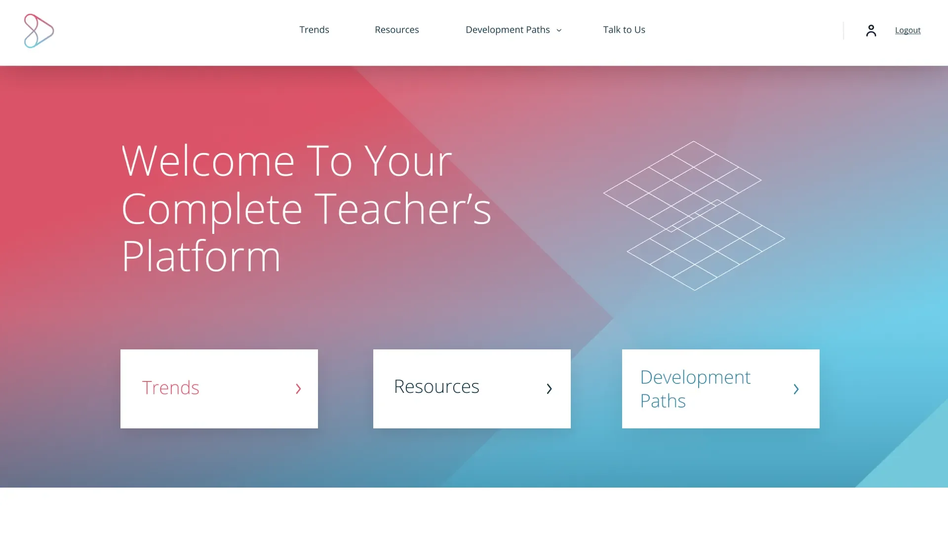
Personalized home experience
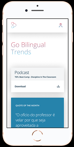
Educational trends and curated content
Teaching resources
Professional development paths
Direct communication with pedagogical specialists
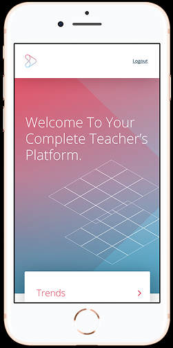
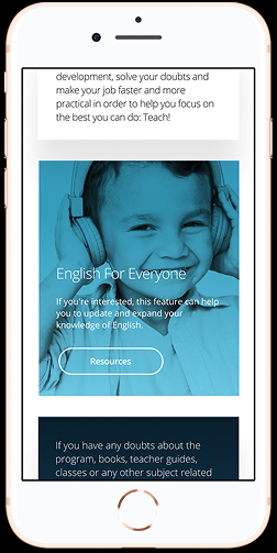
In total, I designed more than 30 responsive screens spanning desktop and mobile experiences, ensuring consistency through the Design System while adapting interactions to different contexts of use.
Throughout development, I worked closely with engineers implementing the platform in React and Ruby.
Because components, behaviors and interface patterns had already been documented inside the Design System, design handoff became substantially more predictable and implementation remained consistent across the product.
Designing the experience